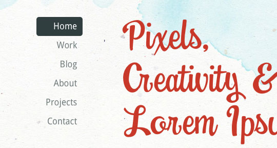
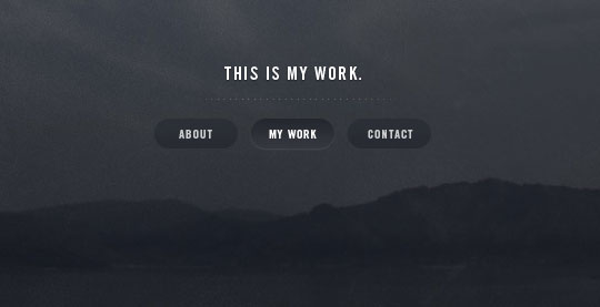
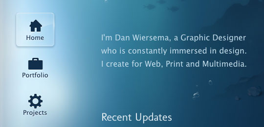
A website’s navigation allows visitors to get from page to page and discover content. That makes it pretty important, I would say. However, some designers feel the need to experiment and try to be clever with navigation design, but when getting around a website becomes a puzzle, visitors will more often leave frustrated. A website’s nav or menu should look like a nav. It should stand out while still matching the rest of the design, and it should be in a location where users expect it. So to give you some inspiration in this area, here are 30 Examples of Excellent Website Navigation.


No comments:
Post a Comment