Saturday, July 17, 2010

Don’t Hold Your Breath For This One

(Pharmacy | Boulder, CO, USA)

(I am counseling a patient on using an inhaler.)


Me: “Do you know how to use an inhaler, sir?”


Patient: “Nope, never used one.”


Me: “Okay, you’ll want to begin inhaling, and then depress the inhaler as you are breathing in. Then, hold your breath for as long as possible to allow the medication to be absorbed into your lungs.”


Patient: “Oh, sort of like smoking pot…”

Hiss-terical Contest

(Pet Store | London, UK)

(It is closing time. I come across a man in the reptile section staring intently at one of our pythons.)


Me: “Sir, just to let you know, the store will be closing in about–”


(The customer silences me and continues to watch the snake.)


Me: “Sir, did you–”


Customer: “I heard you. I’ll be out in a minute. This brat mcan’t last much longer.”


(The snake moves to the side, and so does the customer. It slithers back to its original position and he suite. I notice his eyes are quivering all this time and he hasn’t blinked once.)


Me: “Sir, forgive my asking but are you trying to have a staring contest with Archie there?”


Customer: “Yes.”


Me: “You do know snakes can’t blink, right?”


Customer: Oh, now you tell me? I’ve been challenging this brat for the last ten minutes!”

Must Be That Time Of The Month

(Box Office | Toronto, ON, Canada)

(A customer calls in to order tickets.)


Me: “Thank you for calling [theater], how can I help you?”


Caller: “I need to order tickets to see your show!”


Me: “Alright then, and which show were you looking for?”


Caller: “You mean there’s more than one?!”


Me: “That’s right, we have 6 shows in our season, and 12 from people who rent our space.”


Caller: “Well, I don’t like that many choices!”


Me: “I’m sorry about that, ma’am. Maybe we can narrow it down. Would you like to see one of our current shows or something within the month?”


Caller: “What Month is this?!”


Me: “It’s January.”


Caller: “No, I don’t like January! What else is there?”


Me: *pause* “February?”


Caller: “Hmm. February. FEB-ruary. F-F-F-Feb. No, I don’t like that either!”

Translation Is No Small Feat

(Supermarket | Alabama, USA)

Me: “Hi, thank you for calling [supermarket]. How can I help you?”


Customer: “Hey, can I speak to someone in the ladies wear department?”


Me: “That’d be me. How can I help you?”


Customer: “I bought some scrubs at another store and I was wondering what the ‘S/CH’ on the tag means?”


Me: “It means it’s a small.”


Customer: “But what does the ‘CH’ mean?”


Me: “It’s the Spanish abbreviation for small.”


Customer: “But ‘CH’; isn’t that American?”


Me: “The letters C and H are used in a lot of different languages, including Spanish.”


Customer: “Oh, how strange!”

Friday, July 16, 2010

The most World Cup-crazy countries

Last weekend, Spain won the 2010 World Cup. For the month leading up to the final, Googlers joined the world in cheering for their favorite teams. Around our campus, games were watched on computer screens and on cafe video screens. Code went unwritten. Emails went unanswered.

Throughout the world, real life also slowed during World Cup matches. Which teams had the most loyal fans? Which game captured the attention of world the most? To answer these questions, we looked at counts of queries using Google. People search using Google day and night—except for football fans when a game is on.

These graphs show the volume of Google queries for some of the World Cup matches:


On June 15, as Brazil played its first game against North Korea, the volume of queries from Brazil, shown using a red line, plummeted when the match began, spiked during halftime, fell again and then quickly rose after the match finished.


Queries from Spain during its June 25 game against Chile also decreased during the game, except during halftime. After some post-game querying, Spaniards went to sleep and queries dropped again.

To measure which country has the most loyal fans, we computed the proportional drop in queries during each of its team’s matches compared with normal query volume. Brazil topped the charts with queries from that country dropping by half during its football games. Football powerhouse and third-place winner Germany came in second, followed by the Netherlands and South Korea.


In fourth place, South Koreans were remarkably loyal even though some games began at 3:30am Seoul time. Japan, Australia and New Zealand, also affected by time-zone differences, expressed much less interest. A few countries searched more, not less. But only Honduras and North Korea increased significantly.

During the knockout rounds, each match’s losing team is eliminated from the tournament. As fewer and fewer teams remain, we expected increased worldwide interest in each remaining game. Unsurprisingly, worldwide queries slowed the most during the final game between the Netherlands and Spain, but the round-of-16 Germany v. England game had the second largest query decrease. Semi-finals and quarter-finals were all popular except for semi-final Uruguay v. Netherlands, during which queries actually increased.


In Latin American countries, search volume dropped more steeply leading into and out of matches while, in Europe, searches ramped down and up more gradually. Of course, for games that went into extra time and penalty shootouts the drops deepened the longer the match went on, including Paraguay v. Japan, Netherlands v. Spain, and Uruguay v. Ghana as seen here:


Finally, no blog post about the World Cup would be complete without a look at what did drive people to search—after the final match, of course. Although he won neither the Golden Boot (for the most World Cup goals) nor the Golden Ball (for best player) last weekend, Spain’s David Villa is winning in search compared to the recipients of those two honors—Germany’s Thomas Müller and Uruguay’s Diego Forlán—and Dutch midfielder Wesley Sneijder. All of these men competed for the Golden Boot with five goals apiece.

Similar to when Carlos Puyol headed in the single goal that put Spain in the final, people flocked to the web to search for information on Andres Iniesta, the “quiet man” who scored the one goal that led his country to its first World Cup championships. They were also interested in Dani Jarque, a Spanish footballer who died last fall and whose name was emblazoned on Iniesta’s undershirt, which he displayed after his goal. And after the match, searches for keeper Iker Casillas skyrocketed to a higher peak than any other popular footballer—including household names like Ronaldo, Villa and Messi—reached during the Cup. Sometimes, it seems, goalies get the last word.

We hope you enjoyed our series of posts on World Cup search trends and we’ll see you in Brazil in 2014!

Posted by Jeffrey D. Oldham, Software Engineer and Robert Snedegar, Technical Solutions Engineer

iOS 4.0.1 hitting iPhones right this second


Well it's not the full 4.1 we were expecting... but here's a little tidbit from Apple. One of the main features? The update 'improves the formula to determine how many bars of signal strength to display.' Interesting. We're updating some devices right now, and will report back with what we find.


[Thanks to everyone who sent this in]

iOS 4.0.1 hitting iPhones right this second originally appeared on Engadget on Thu, 15 Jul 2010 14:16:00 EDT. Please see our terms for use of feeds.

Permalink

Thursday, July 15, 2010

Rumored HTC Desire HD specs surface: 4.3-inch screen, 8-megapixel camera


We didn't have a ton of details on the so-called HTC Ace when it turned up in a leaked roadmap last week, but a fresh set of rumors are now suggesting that the Ace is actually the Desire HD, which will reportedly pack a number of HD-esque upgrades over the standard Desire. That includes a larger 4.3-inch WVGA screen -- no word if it's AMOLED or SLCD -- and an 8-megapixel camera with 720p video recording. Other rumored details include Android 2.2, 4GB of internal storage, the same 1GHz Snapdragon as the current Desire and, perhaps most interestingly, talk of a 'unibody aluminum design.' Unfortunately, the rumors still don't include any actual images of the device, but there's still plenty of time for those to leak out before the supposed October release.

Rumored HTC Desire HD specs surface: 4.3-inch screen, 8-megapixel camera originally appeared on Engadget on Thu, 15 Jul 2010 13:59:00 EDT. Please see our terms for use of feeds.

Permalink SlashGear | sourceSuperETrader

Brammo goes street fighting with the 100mph Empulse electric motorcycle (video)


Brammo goes street fighting with the 100mph Empulse electric motorcycle (video)

When we took Brammo's Enertia motorcycle for a test ride last summer we found it to be a lovingly crafted and fun to ride bike that really only disappointed when it came to ultimate performance -- far closer to your average scooter than your average sportbike. Since then the company has gone racing, taking on the iconic Isle of Man as part of the all-electric TTXGP and finishing third place with a top speed of 102mph. That fully-faired bike was called the TTR, and now the company is making a naked version for you: the 100mph Empulse. Read on for full details and a little video too.

Continue reading Brammo goes street fighting with the 100mph Empulse electric motorcycle (video)

Brammo goes street fighting with the 100mph Empulse electric motorcycle (video) originally appeared on Engadget on Thu, 15 Jul 2010 09:30:00 EDT. Please see our terms for use of feeds.

Permalink

Should Have Gone For (M)Academia


(Bakery | California, USA)

Customer: “What’s in the White Chocolate Macadamia cookie?”


Me: “White chocolate and macadamias.”


Customer: “Oh, duh,. That was a stupid question.”


Me: “It’s okay, people ask me all the time what kind of nuts are in the ‘Chocolate Almond Joy’.”


Customer: “Oh yeah, ha ha! Walnuts!”

Overly Essaying The Situation


(Community Outreach Center | Atlanta, GA, USA)

Me: “What can I help you with today, sir?”


Customer: “Well for starters, you can talk to that girl at the front desk. She made me fill out so much paperwork!”


Me: “I’m sorry. She must have been mistaken. Can you show me the forms you were asked to complete?”


Customer: “No. I don’t have them.”


Me: *confused* “Where are they?”


(The man proceeds to lead me to the front desk and gestures at the sign-in sheet where visitors are asked to write their name and zip code.)


Customer: “This! She made me write all this!”

Cutting Down Credit Fraud

(Call Center | Managua, Nicaragua)

Me: “Thank you for calling [bank], how can I help you?”


Caller: “Hey man! I got some fraudulent charges on my credit card.”


Me: “Ok sir, I understand let me help you report this.”


Caller: “Don’t worry son, I already took care of it.”


Me: “So you already called to report it?”


Caller: “No son, I cut my credit card in thousands of pieces. Now I need a new one.”

Uphill Struggle

(Ski Resort | Mont Cenis, France)

( I am providing a guided skiing tour of the mountain.)


Customer: “So, where are we going next?”


Me: “Well, do you see that lift over there?”


Customer: “Yeah.”


Me: “Well, we’re going to head up that one until we reach the top of the mountain, and then–”


Customer: “Are you kidding? It’ll be cold up there, and we’ll just have to ski back down again!”

Is A New And Improved MacBook Air Coming Later This Year? Likely.

Computer manufacturers generally update their notebook lines every few months — except for Apple. At best Apple updates their notebook lines twice a year and even longer for the MacBook Air, which received its last major update in mid-2009. Even that was just a processor and battery bump as the storage, graphics, screen, and memory were carried over from the late-2008 refresh.

Rani Taj - Dhol Mixing live to Rude Boy - Rihanna


Rani Taj - Dhol Mixing live to Rude Boy - Rihanna

Apple and HTC lead charge as smartphone market looks set to grow and grow


A recent survey of 4,028 US consumers by ChangeWave has thrown up a number of illuminating statistics, which you might consider as predictable as they are informative. The chief takeaway is that people are keen on buying smartphones like never before, with 16% of respondents saying that they'll be taking the plunge within the next 90 days, which marks the biggest increase in the survey's history. Secondly, and crucially for vendor loyalists, Apple and HTC seem to be the biggest beneficiaries (or are they the stimulants?) of this interest, with both improving their share by over 50 percent between March and June of this year. RIM and Motorola have taken a tumble in that same timespan, while Palm has sadly failed to register even a single percentage point. We can definitely see the Droid X and BlackBerry 6 remedying things for the big boys, but Palm's route out of ignominy seems a little less straightforward. You'll find a chart of customer satisfaction -- dominated by Apple in imperious fashion -- after the break, and the full breakdown at the source link.

Continue reading Apple and HTC lead charge as smartphone market looks set to grow and grow

Apple and HTC lead charge as smartphone market looks set to grow and grow originally appeared on Engadget on Thu, 15 Jul 2010 05:49:00 EDT. Please see our terms for use of feeds.

Permalink Electronista | sourceChangeWave Research

Mixing Type and Imagery: How to Manage a Controlled Collision

photo set into text By setting images in type, you are able to express more than words or pictures can alone.


The effect packs a lot of information into a tight space. But it can get ugly if the text and imagery are at odds with each other.


Designers can steer clear of disaster by keeping their purpose in mind: expressing the idea clearly should trump the “wow” factor of the technique.


Setting images directly in text mixes the straightforward communication of words with the emotional effect of photos.


Words state, and photos express. But when images get lost or text becomes muddled, or both, we get conflict. Images and text can be harmonized seamlessly, but only if we follow some guidelines that balance the readability of both. Read on to find out how to effectively mix text and imagery.


Balancing Text and Image Readability


Think of letterforms as picture frames… albeit unusual ones. Setting an image in text requires that you remove chunks from the picture. To retain the readability of the image, you’ll have to decide which parts of the image matter. It’s best if the letterforms don’t intrude too much on the picture.


sample of how letters cut into photos


Above, two triangles cut into the photo from the top and bottom. That’s good for the text, which is now a recognizable “N,” but bad for the photo, because some detail has been removed from the focal point of the image (i.e. the flower).


To figure out how images and text can (and can’t) mix, we begin with the letterforms. The obvious starting point is choosing the right type weight.


sample of text too thin for the photo within


Myriad Pro Light is legible at the point size shown above. The edges of the letters are clear, and most of the colors contrast well against the background. But the photo is reduced to an abstract texture.


thicker text shows more image


Changing the typeface to Myriad Pro Black reveals more of the photo. The text is harder to read because there’s more detail to catch the eye, but the word “Spring” is legible.


Choosing a thick typeface isn’t enough. We can improve image legibility another step by tracking the word, thus applying Gestalt principles—specifically “reification,” a term from Gestalt psychology that describes how we make whole images and shapes with our minds even when our eyes are given only pieces or hints.


better kerning helps the photo


Above, the letters are kerned together to create a more coherent “stage” on which the photo can appear.


In detail 1, the letterforms are deliberately overlapped to show entire shapes within the photo—but not so much that they obscure the word.


In detail 2, three letters with vertical sides are spaced far enough apart that you can recognize them as letters, but are close enough to let the flower’s petals “hop” across the white gaps. The black lines show implied lines that people connect subconsciously. At least one more Gestalt line of sight hops across letters in the word above. If you see it, leave a comment below.


Tight kerning tends to create solid blocks, which look interesting but can be cumbersome. The solution is to leave gaps between matching (or parallel) lines but to tighten areas that don’t naturally fit together.


careful kerning keeps letters readable


Here, letters with matching lines (such as the vertical sides of “r,” “i,” and “n”) aren’t as easy to read when pressed together. That open space is good for photos but bad for letters. Of course, attaching letters whose shapes match isn’t always a bad idea, but they should be as legible as possible.


Mo’ Photos, Mo’ Problems


One photo and a short word is easy. Multiple photos across two lines requires more effort.


sample of twelve letters with many different images


“Active summer” conjures a certain kind of imagery. The composition above has some merit. It shows a variety of photos: portraits, macros, landscapes. The text is set into an even block. And the typeface is thick enough to show most of the imagery. But there are problems.


diagram of the problems


While a few things work well, the composition is riddled with problems. Specifics are labeled in the diagram above, but most have the same cause: the letters and photos interfere with each other. We can resolve the issues by making slight changes.


improved composition with photos


Our major changes here include:


  • The image of the person in “S” is moved to the “e” in “active.”

  • New images are set in the “m,” “e” and “r” in “summer.”

  • The image of the person in the “e” in “summer” is moved to the “u.”

  • The river image is moved from the “i” to the “S” in summer and is shrunk to reveal its source.

  • The diving board is moved to the “i,” and the diver is fit into the dot above.


diagram of the solutions and remaining problems


It’s better, but not perfect. The second “m” is still lost in the background. Also, adding photos with vibrant colors widens the color palette, which can be a problem. Let’s try again.


remaining solutions


We can give thin borders to the “e” in “active” and the second “m” in “summer.” The borders here are deliberately kept faint (45% opacity) to avoid drawing attention to themselves. We can also give the “S” in “summer” a border, but only where necessary (on the whitewater). Borders are necessary only where light-colored elements meet the white background.


The “r” in “summer” features white clouds that blend into the background. But the designer decided that the “r” shape was still legible, so a border was unnecessary.


Sometimes solutions appear when you are looking for problems. During our third round of changes above, for example, the designer isolated the cannonball diver from the background, which creates a more direct interaction between the image and text.


The final touch is to blend the colors. This unifies each word.


photos in text, tinted


From slight shifts in hue to outright monotones, each word above receives varying degrees of tint. Despite the variety of subjects, scales and angles, similar colors helps each word stand on its own. Is this necessary? It depends on one’s goals.


If tying the words together is more important than having realistic color, then the technique above could work. But tinting is a solution that should be applied only if there’s a problem—that is, only if the intended meaning is getting lost.


Reduce, Reuse and Recycle Photos


One last problem with this composition is the sheer number of images used. Each letter seems to contain a distinct photo; if purchased as stock art, 12 photos could run up a big tab.


In fact, only seven photos were used in this composition. Two of the seven were used only once. One was used three times. Take a look:


seven images used over twelve letters


Setting photos into letterforms always requires cropping, so busy images—like the photo of the four people—can be cut in different ways and reused many times.


Changing Text to Fit Imagery


The two words we just dealt with, “Active Summer,” are set in the same typeface but in different point sizes to keep their edges consistent. When using one letter per image, the design decision is arbitrary. When dealing with a single image, however, the shape of the text is critical; keeping the overall text shape as close to the image’s proportions as possible is best. For example:


samples of text shapes


“Espresso House” is a long phrase, poorly suited to a 4×3 image. The solution is to adapt the text to fit the photo:


  • The words are stacked to create a block.

  • The word “house” is enlarged so that its left and right edges match those of “espresso.”

  • The “H” in “house” is uppercase, but shrunk to match the height of “ouse.” As little space as possible is left between the two words.

  • Though not always desirable, here the descender in “espresso” is allowed to meet the “o” in “house.”


Legibility is important but to some degree subjective. Certain techniques favor the image, and others favor the text. This interplay is left to the designer, who understands the goals of the task.


examples of emphasis on the text vs image


We can emphasize the text by increasing contrast around the edges of the letters (left). To emphasize the image, we show the faded image in the white space between the letters (right). “Ghosting” muddles the text but shows the image as a whole.


How to Set Images in Text with Photoshop


There are many ways to overlay images onto text, but these examples were created with a recipe developed by trial and error.


technique, step 1


First, set the text in a Photoshop document. This composition is 615 pixels wide because that fits Webdesigner Depot’s specs. When creating your own, fit the size to your project.


To see the edges of the letters clearly, start with black text on a white background. When you’re finished, set the text layer’s opacity to 20%.


palette, step 1


Above, the Photoshop layers palette in the first step.


technique, step 2


Second, flatten the word into the background to create gray letters on solid white. Then retype the letters, one per layer, using the background as a guide.


palette, step 2


Above, the Photoshop layers palette in the second step.


technique, step 3


Third, add photos or parts of photos to the composition as separate layers. “Clipping” the layers (Layer → Create Clipping Mask) lets the top layer (in this case, each photo) appear only where the underlying layer (each letter) appears.


palette, step 3


Above, the Photoshop layers palette as we add photos.


technique, step 4


Repeat as needed.


Adapting the Idea


Any photo, illustration or texture can work with text in this way. The key is to strike the right balance of clarity between text and imagery.


composition that mixes non-photo imagery with text


Written exclusively for Webdesigner Depot by Ben Gremillion. Ben is a freelance web designer who solves communication problems with better design.


How do you manage the collision of type and imagery? Please share your thoughts below…


If you find an exclusive RSS freebie on this feed or on the live WDD website, please use the following code to download it: H0Oa9C

EGGS

demotivational posters - EGGS


EGGS

The Air Force will destroy them with unparalleled violence


Submitted by: EzraGarrison via deMotivational Builder


Video: Does iOS 4.1 fix the iPhone 4′s death grip antenna issue?


The first software update for iOS 4 and the iPhone 4 is here!


And now, to answer the question that seems to be on just about everyone’s mind: Does it fix the iPhone 4′s death grip issue — or at least make an effort to appear to?


Read the rest at MobileCrunch >>

Millennial Media: Apple OS Grows By 36 Percent In June, Android Up By 23 Percent

Mobile ad network Millennial Media, which claims that its network reaches 82 percent of 72 million mobile web users in the U.S., is reporting that globally, Apple OS requests are up by 36 percent in June, after dropping 33 percent in May.


Android requests continued to rise, and grew another 23 percent month over month. Android is now up a whopping 439% since January. iPad requests are also increasing at a fast rate, growing 206 percent in June, after rising 160 percent in May. RIM ad requests increased percent month-over-month, posting a 41 percent increase in requests since January.


In terms of ad impressions, Apple’s OS remained the leading Smartphone OS on Millennial’s network in June with a 56 percent share of impressions and an 8% growth month-over-month. RIM was the second largest Smartphone OS for the eleventh consecutive month, representing a 17 percent share of impressions for June, dropping by 2 percent from last month. Android’s OS remained the third largest operating system in for the fourth consecutive month, representing 11 percent of impressions, dropping by 4 percent from May.


When splitting ad impressions by device manufacturer, Apple had the largest share increase of 4 percent with approximately 30 percent share of impressions in June. Motorola moved into the number four position, passing HTC and LG, with the mobile company’s devices representing an 8 percent share of impressions for the month. This growth is largely driven by the Droid device, says Millennial.


Android devices represented six of June’s Top 20 Mobile Phones. The Motorola Droid moved into the top five and the HTC Droid Incredible also entered into the Top 20 at number 13. Of the top 20 mobile phones on Millennial’s network, 13 were smartphones, which represented 43 percent impression share in June. Not to be left out, RIM took the number two spot on the device list with the Curve; RIM devices now account for four of the Top 20 Mobile Phones in June


As we wrote last month, Millennial has added new measurement data focusing on mobile developer channels and trends. Gaming apps once again took the number one spot for and accounted for 41 percent of apps on the network in June. Music apps, as well as Food and Dining apps, experienced significant increases in June. Sports-focused apps took the third position, accounting for 7 percent of apps on the network, rising from the number six spot in May. This could reflect increased use and downloads of sports related apps because of the World Cup games, Stanley Cup Finals and and NBA finals.


In terms of platform, 89 percent of developers were creating apps for a single platform, while 11 percent of developers are developing for multiple platforms. Of the developers who focused on a single platform, 31 percent were focused on Android which is a 2 percent increase month-over-month


While Android continues to grow at a steady rate, it looks like the iPhone OS is back on a growth pattern after a few months of declines in ad requests and impressions. This could be because of increased iPad use as well as the rollout of the iPhone 4 in mid to late June.


As one of the largest mobile ad networks that has not been acquired by a tech giant, Millennial has been seeing impressive growth and reach. The Baltimore-based company has rolled out an iPad SDK, and acquired mobile metrics and analytics firm TapMetrics earlier this year. The company is also well funded; Millennial just raised $16 million in Series C funding last November.


The big question that still remains is the long-term effect of Apple’s iAd platform on the space. iAds are performing well for advertisers and publishers, and should be a veritable competitor to other mobile advertising platforms.


And there is still the question of how Apple’s new iAd policies on outside networks advertising will play out. While the policy initially was thought to have excluded Google’s AdMob from serving ads on the iPhone, we learned this week that AdMob ads are still being served the iPhone. As we’ve written in the past, Millennial’s future may be in question if the network is looking to be acquired by a major tech giant, like Microsoft. That is if Apple starts enforcing their rules. But perhaps the FTC’s rumored informal investigation into Apple’s iAd policies has changed the game for Apple. And this could no doubt mean good things for Millennial’s future.


30 Examples of Excellent Website Navigation

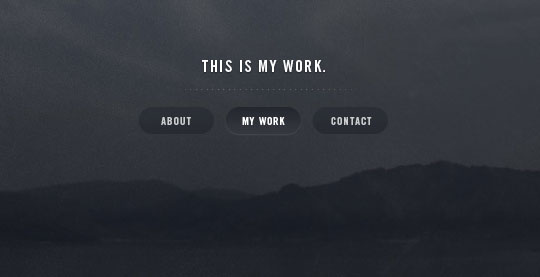
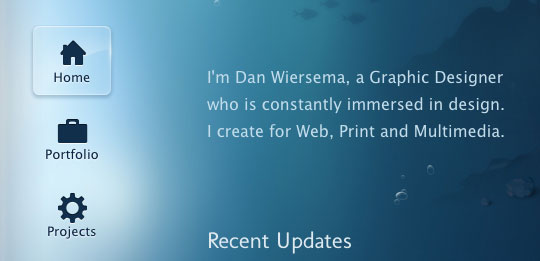
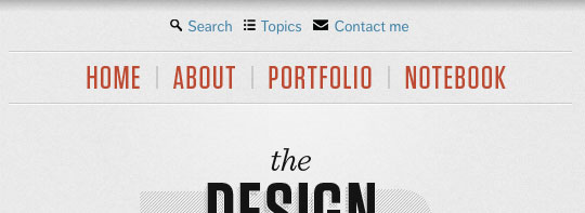
A website’s navigation allows visitors to get from page to page and discover content. That makes it pretty important, I would say. However, some designers feel the need to experiment and try to be clever with navigation design, but when getting around a website becomes a puzzle, visitors will more often leave frustrated. A website’s nav or menu should look like a nav. It should stand out while still matching the rest of the design, and it should be in a location where users expect it. So to give you some inspiration in this area, here are 30 Examples of Excellent Website Navigation.


The Idea Lists


website navigation


Collision


website navigation


Tobias Ahlin


website navigation


Carbonmade


website navigation


dConstruct 2010


website navigation


Jeroen Homan


website navigation


Brizk Design


website navigation


Dribbble


website navigation


Buffalo


website navigation


TedxToronto


website navigation


David A. Molanphy


website navigation


Fully Illustrated


website navigation


Live Books


website navigation


Rich Brown


website navigation


I Love Dust


website navigation


Blue Sky Resumes


website navigation


Soh Tanaka


website navigation


Kyle Myer


website navigation


Yaron Schoen


website navigation


Unconventional Guides


website navigation


HAUS


website navigation


Christopher Meeks


website navigation


Dan Wiersema


website navigation


Williamson County Casa


website navigation


Marie Catrib’s


website navigation


The Design Cubicle


website navigation


Exclusive Reels


website navigation


AFD Folio


website navigation


Veerle’s Blog


website navigation


Drexler


website navigation